All Results
Featured blogs

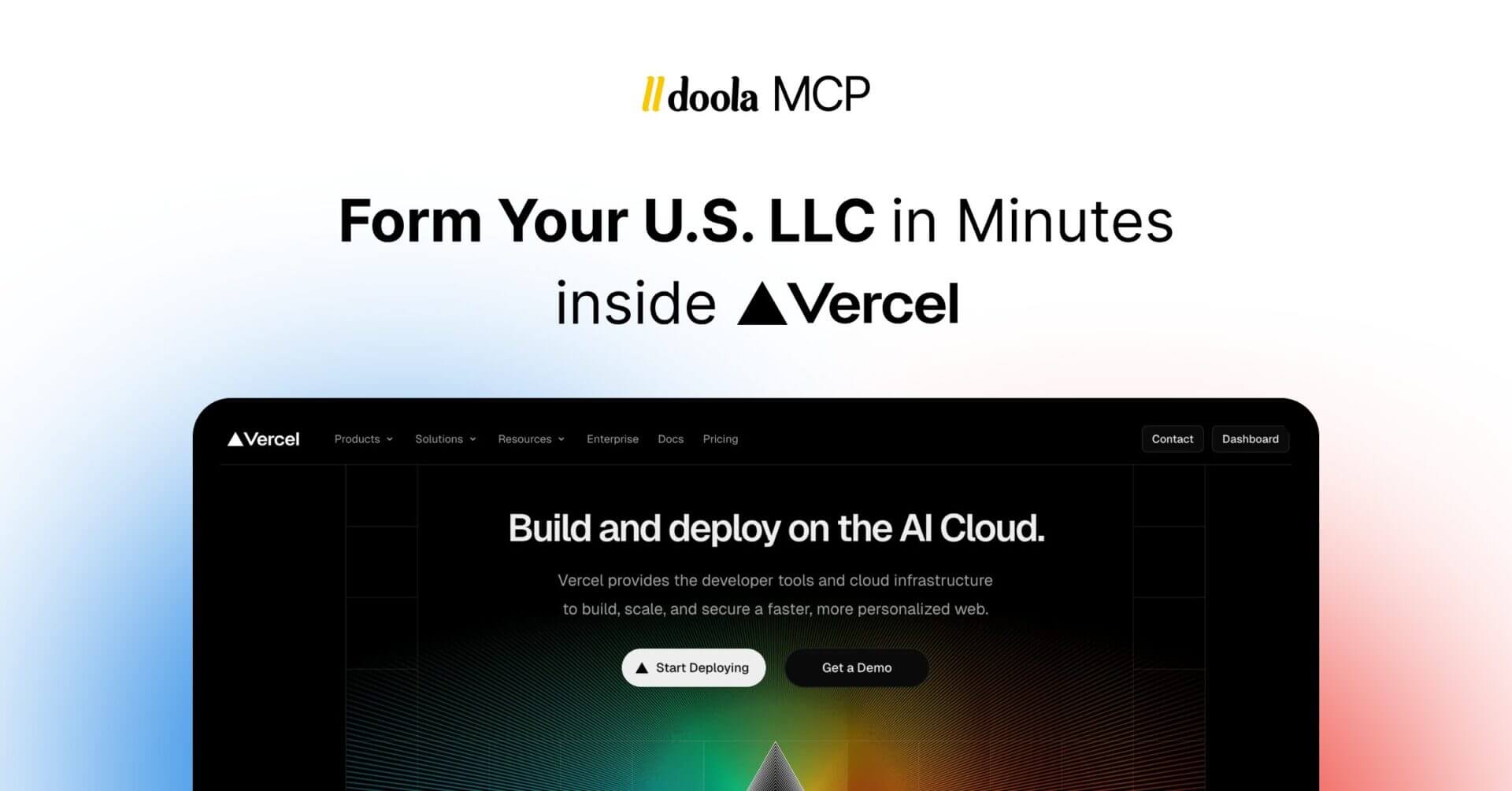
How to Open an LLC for Non US Residents: 8 Simple Steps to Get Started
We've personally helped hundreds of founders from around the world launch, maintain and grow US LLCs. Here's a list of their most common questions. Opening an LLC can be the first step to launching your US business. Even as a non-resident...

Alison K Plaut
Published on 25 May 2025 15 min read
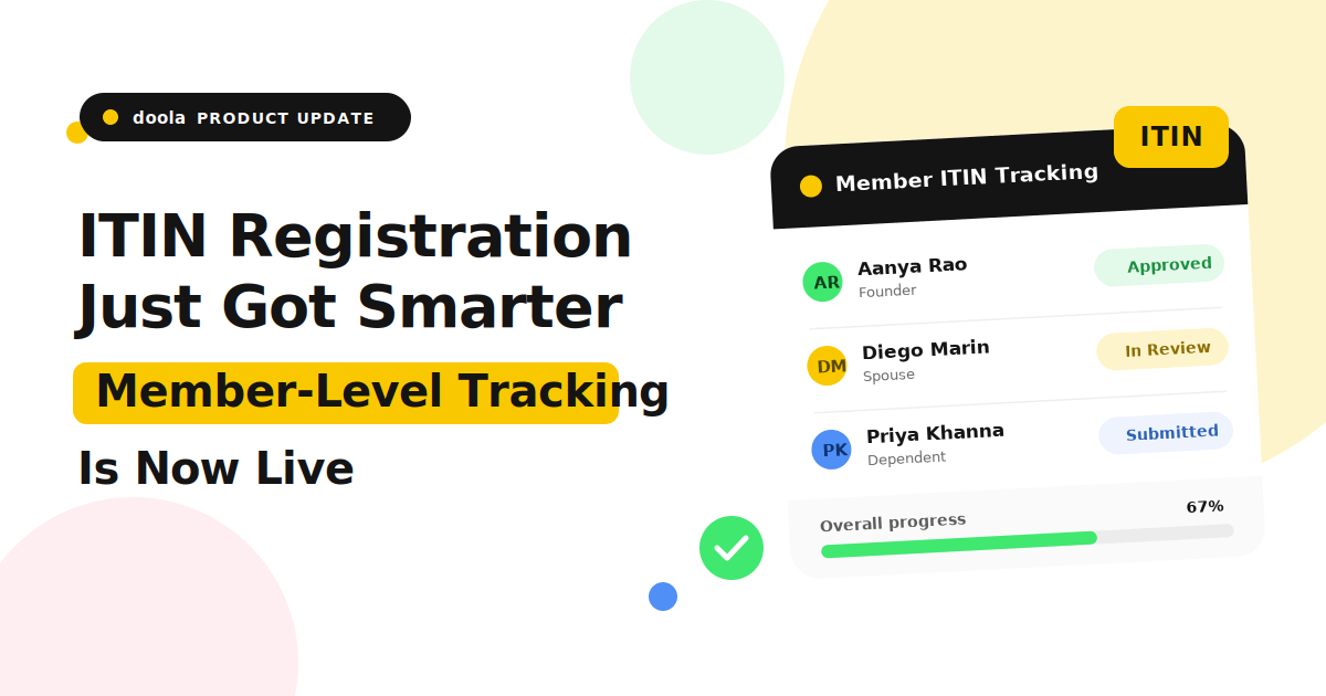
Do I Need an SSN, EIN, or ITIN? How Are They Different?
Don't know the difference between an SSN, EIN, or ITIN? We break it down in this post.
Alison K Plaut
26 May 2025

How to Create a US Stripe Account - International Founder Guide
Kenan Sagouspe
21 May 2025
Start your dream business
with doola today
We form your U.S. business in any of the 50 states and ensure it stays 100% compliant.

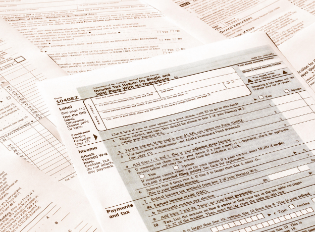
US Tax Filing Requirements for International Founders - Your Guide
There are certain requirements you have to comply with when filing US tax for your busi...
Arjun Mahadevan
28 Apr 2025

Wyoming vs Delaware LLC: Which is Better For You in 2026?
Arjun Mahadevan
3 Feb 2025

How Much Does an LLC Cost in Every State (2026 Guide)
Discover this ultimate breakdown that shows you all the different LLC fees state-by-state.
Ritika Dixit
18 May 2025

